
Object-Oriented Programming with Java, part I + II

This material is licensed under the Creative Commons BY-NC-SA license, which means that you can use it and distribute it freely so long as you do not erase the names of the original authors. If you make changes in the material and want to distribute this altered version of the material, you have to license it with a similar free license. The use of the material for commercial use is prohibited without a separate agreement.
Authors: Arto Hellas, Matti Luukkainen
Translators to English: Emilia Hjelm, Alex H. Virtanen, Matti Luukkainen, Virpi Sumu, Birunthan Mohanathas, Etiënne Goossens
Extra material added by: Etiënne Goossens, Maurice Snoeren, Johan Talboom
The course is maintained by Technische Informatica Breda
Other basic components
Last week we have seen some basic JavaFX controls such as Button, Label and TextField. There are many more basic UI controls. In this chapter we will explain a few of them.
RadioButtons
A RadioButton is a button that can be selected or not selected. The RadioButton cannot be “deselected” once it’s selected. To deselect it, select another radiobutton in the same radiobutton group
You create a RadioButton using its constructor. Here is a RadioButton instantiation example:
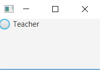
RadioButton teacherRadioButton = new RadioButton("Teacher");
The String passed as parameter to the RadioButton constructor is displayed next to the RadioButton.
To make a RadioButton visible you must add it to the scene graph of your application. This means adding the RadioButton to a Scene, or as child of a layout which is attached to a Scene object.
Here is an example that attaches a RadioButton to the scene:
public void start(Stage stage) {
    RadioButton teacherRadioButton = new RadioButton("Teacher");

    HBox hbox = new HBox(teacherRadioButton);

    Scene scene = new Scene(hbox, 200, 100);
    stage.setScene(scene);
    stage.show();
}
The application resulting from running this example looks like this:
The RadioButton class has a method named isSelected which lets you determine if the RadioButton is selected or not. The isSelected method returns a boolean with the value true if the RadioButton is selected, and false if not. Here is an example:
boolean isSelected = teacherRadioButton.isSelected();
Combining RadioButtons in groups
Radio buttons are typically used in a group to present several mutually exclusive options. Groups are defined by using the object ToggleGroup from the JavaFX library. When ToggleGroup is used, only one radio button inside the group can be selected.
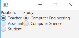
In the example above we create two groups of RadioButtons in order to have two inputs. The following code is used
public void start(Stage stage) {

    // Position section
    ToggleGroup positionToggleGroup = new ToggleGroup();
    Label positionLabel = new Label("Position:");

    RadioButton teacherRB = new RadioButton("Teacher");
    teacherRB.setToggleGroup(positionToggleGroup);
    teacherRB.setSelected(true);

    RadioButton assistantRB = new RadioButton("Assistant");
    assistantRB.setToggleGroup(positionToggleGroup);

    RadioButton studentRB = new RadioButton("Student");
    studentRB.setToggleGroup(positionToggleGroup);

    VBox positionVBox = new VBox();
    positionVBox.getChildren().addAll(positionLabel, teacherRB, assistantRB, studentRB);

    // Study section
    ToggleGroup studyToggleGroup = new ToggleGroup();
    Label studyLabel = new Label("Study:");

    RadioButton compEngRB = new RadioButton("Computer Engineering");
    compEngRB.setToggleGroup(studyToggleGroup);
    compEngRB.setSelected(true);

    RadioButton computerScienceRB = new RadioButton("Computer Science");
    computerScienceRB.setToggleGroup(studyToggleGroup);

    VBox studyVBox = new VBox();
    studyVBox.getChildren().addAll(studyLabel, compEngRB, computerScienceRB);

    // Add everything towards the UI
    BorderPane borderPane = new BorderPane();
    HBox hBox = new HBox();
    hBox.getChildren().addAll(positionVBox, studyVBox);
    borderPane.setCenter(hBox);

    Scene firstScene = new Scene(borderPane);
    stage.setScene(firstScene);
    stage.show();
}
The application resulting from running this example looks like this:
The selected radio button can be found by using the method isSelected on the object RadioButton, which returns a Boolean value, or the selected object RadioButton can be found using the method getSelectedToggle on the object ToggleGroup. If no RadioButton is selected the getSelectedToggle method returns null .
RadioButton selectedGroup = (RadioButton)studyToggleGroup.getSelectedToggle();
System.out.println(selectedGroup.getText());
It’s also possible to add EventHandler to see if the selection is changed like in the example below, which displays a pop-up when Computer Engineering is selected.
compEngRB.setOnAction(e -> {
    if (compEngRB.isSelected()) {
        new Alert(Alert.AlertType.INFORMATION, "TI 4 all!", ButtonType.OK).show();
    }
});
But sometimes it is more convenient to create an EventHandler on the ToggleGroup. This allows you to only create one EventHandler for the ToggleGroup. You can implement it using the following code
studyToggleGroup.selectedToggleProperty().addListener(
                (ov, old_toggle, new_toggle) -> {
                    if (studyToggleGroup.getSelectedToggle() != null) {
                        String text = ((RadioButton)studyToggleGroup.getSelectedToggle()).getText();
                    }
                });
Exercise gui-extra-1 Calculator
In this exercise you will create a GUI calculator using RadioButtons. The end result of the program looks like this:
gui-extra-1.1 Create the GUI
The first step is to create a semilair GUI as shown the image above. On the left side of the screen add two
TextFields with labels in front of it. On the right side of the screen add 4 RadioButtons with the text: Addition, Substraction, Multiplication and Divisiongui-extra-1.2 Implement the functionality
The next step is to implement the functionality to our calculator. When the user changes the selection of the
RadioButtons the program should calculate the result of number1 (operator from checkbox) number2

CheckBoxes
A CheckBox is a button which can be in two different states: Selected and not selected. The CheckBox control is represented by the class javafx.scene.control.CheckBox.
You create a CheckBox control via the CheckBox constructor. Here is a CheckBox instantiation example:
CheckBox greenCheckBox = new CheckBox("Green");
The String passed to the CheckBox constructor is displayed next to the CheckBox control.
To make a CheckBox control visible you must add it to the scene graph of your application. That means adding the CheckBox control to a Scene object, or to some layout component which is itself added to a Scene object.
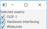
Here is an example showing how to add a CheckBox to the scene graph:
public void start(Stage stage) {

    // Checkboxes
    Label examLabel = new Label("Selected exams:");
    CheckBox ogp1CheckBox = new CheckBox("OGP-1");
    CheckBox hwiCheckbox = new CheckBox("Hardware interfacing");
    CheckBox wiskundeCheckBox = new CheckBox("Wiskunde");

    VBox selectedCourse = new VBox();
    selectedCourse.getChildren().addAll(examLabel, ogp1CheckBox, hwiCheckbox, wiskundeCheckBox);

    Scene firstScene = new Scene(selectedCourse);
    stage.setScene(firstScene);
    stage.show();
}
The application resulting from running this code looks like this:
The method isSelected can be used to check if the Checkbox is selected. It’s also possible to add EventHandler to see if the selection is changed like in the example below
wiskundeCheckBox.setOnAction(e -> {
    if (wiskundeCheckBox.isSelected()) {
        new Alert(Alert.AlertType.INFORMATION, "Math 4 all!", ButtonType.OK).show();
    }
});
Pictures
There are several ways to display an image inside a Java application. One straightforward approach used JavaFx’s the class Image and the class ImageView.
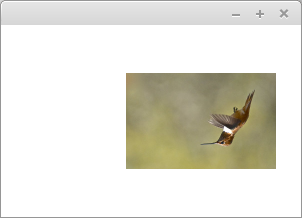
The parameter given to Image class is the name of the image file to be opened. The name should start with the prefix file:, this means the image is a file. In the example below, the file humming.jpg is given as parameter towards the ImageView. Then the ImageView object is placed in the Layout. The layout is placed into the Scene Object and placed inside the view.
import javafx.application.Application;
import static javafx.application.Application.launch;
import javafx.scene.Scene;
import javafx.scene.image.Image;
import javafx.scene.image.ImageView;
import javafx.scene.layout.Pane;
import javafx.stage.Stage;

public class ImageApplication extends Application {

    @Override
    public void start(Stage stage) {

        Image image = new Image("file:humming.jpg");
        ImageView imageView = new ImageView(image);

        Pane pane = new Pane();
        pane.getChildren().add(imageView);

        stage.setScene(new Scene(pane));
        stage.show();

    }

    public static void main(String[] args) {
        launch(args);
    }
}
Executing a program creates the following window. It is assumed that the file humming.jpg exists and is found at the root of the project (from the same folder as the file pom.xml).
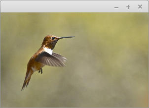
The example uses the picture Linda Tanner available at http://www.freestockphotos.biz/stockphoto/17874. Image is licensed under the Creative Commons CC BY 2.0 license.
Simple image processing
The class ImageView provides a set of methods for image (simple processing). In other words, the image can be rotated, its size can be changed and it can be moved on the screen. In the example below, the picture is rotated around, its size is halved and moved slightly to the right.
@Override
public void start(Stage stage) {

    Image image = new Image("file:humming.jpg");
    ImageView imageView = new ImageView(image);

    imageView.setRotate(180);
    imageView.setScaleX(0.5);
    imageView.setScaleY(0.5);

    imageView.setTranslateX(50);

    Pane pane = new Pane();
    pane.getChildren().add(imageView);

    stage.setScene(new Scene(ruutu));
    stage.show();
}
Exercise gui-extra-2 Rotate pictures
In this exercise you will create a program that displays a picture on the screen.
gui-extra-2.1 Create the GUI
The first step is to create a semilair GUI as shown the image above. On the left side of the screen add an
ImageView. On the right side of the screen add 4 Buttons with the text: Larger, Smaller, Rotate CW and Rotate CCWgui-extra-2.2 Implement the functionality
The next step is to implement the functionality to our program. The behavior of the program should be:
- Larger: The size of the image increased with 10%.
- Smaller: The size of the image decrees with 10% with a minimum size of 0%
- Rotate CW: The picture rotates 45 degrees into clockwise direction.
- Rotate CCW: The picture rotates 45 degrees into counter clockwise direction.

ComboBox
The ComboBox control enables users to choose an option from a predefined list of choices, or type in another value if none of the predefined choices matches what the user wants to select. The ComboBox control is represented by the class javafx.scene.control.ComboBox.
You create a ComboBox simply by creating a new instance of the ComboBox class. Here is a ComboBox instantiation example:
ComboBox comboBox = new ComboBox();
You can add choices to a ComboBox by obtaining its item collection and add items to it. Here is an example that adds choices to a ComboBox:
comboBox.getItems().add("Choice 1");
comboBox.getItems().add("Choice 2");
comboBox.getItems().add("Choice 3");
To make a ComboBox visible you must add it to the scene. This means that you must add the ComboBox to a Scene object or to some layout component which is then attached to the Scene object.
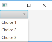
Here is an example showing how to add a ComboBox to the scene:
public void start(Stage stage) {
    ComboBox comboBox = new ComboBox();

    comboBox.getItems().add("Choice 1");
    comboBox.getItems().add("Choice 2");
    comboBox.getItems().add("Choice 3");

    HBox hbox = new HBox(comboBox);

    Scene scene = new Scene(hbox, 200, 120);
    stage.setScene(scene);
    stage.show();
}
The application resulting from running this example would look similar to this:
You can read the selected value of a ComboBox via its getValue method. If no choice is selected, the getValue method returns null. Here is an example of calling getValue:
String value = (String) comboBox.getValue();
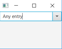
A ComboBox is not editable by default. That means, that by default the user cannot enter anything themselves, but only choose from the predefined list of options. To make a ComboBox editable you must call the setEditable method of the ComboBox. Here is an example making a ComboBox editable:
comboBox.setEditable(true);
Once the ComboBox is editable the user can type in values into the ComboBox. The entered value is also read via the getValue method as explained earlier. The following screenthot shows a ComboBox which is editable, and with a custom value entered:
ListView
The ListView control enables users to choose one or more options from a predefined list of choices. The ListView control is represented by the class javafx.scene.control.ListView.
You create a ListView simply by creating a new instance of the ListView class. Here is a ListView instantiation example:
ListView listView = new ListView();
You can add items (options) to a ListView by obtaining its item collection and add items to it. Here is an example that adds items to a ListView:
listView.getItems().add("Item 1");
listView.getItems().add("Item 2");
listView.getItems().add("Item 3");
To make a ListView visible you must add it to the scene. This means that you must add the ListView to a Scene object or to some layout component which is then attached to the Scene object.
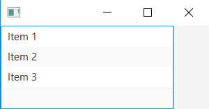
Here is an example showing how to add a ListView to the scene:
public void start(Stage stage)  {
    ListView listView = new ListView();

    listView.getItems().add("Item 1");
    listView.getItems().add("Item 2");
    listView.getItems().add("Item 3");

    HBox hbox = new HBox(listView);

    Scene scene = new Scene(hbox, 300, 120);
    stage.setScene(scene);
    stage.show();
}
The application resulting from running this example would look similar to this screenshot:
Like we noticed inside ComboBoxes, it’s recommened to use an OberservableList when items can be changed.
Notice how the ListView shows multiple options by default. You can set a height and width for a ListView, but you cannot set explicitly how many items should be visible. The height determines that based on the height of each item displayed.
If there are more items in the ListView than can fit into its visiible area, the ListView will add scroll bars so the user can scroll up and down over the items.
You can read the selected indexes of a ListView via its SelectionModel. Here is an example showing how to read the selected indexes of a ListView:
ObservableList selectedIndices = listView.getSelectionModel().getSelectedIndices();
The OberservableList will contain Integer objects representing the indexes of the selected items in the ListView.
Here is a full example with a button added which reads the selected items of the ListView when clicked:
import javafx.application.Application;
import javafx.collections.ObservableList;
import javafx.scene.Scene;
import javafx.scene.control.Button;
import javafx.scene.control.ListView;
import javafx.scene.control.SelectionMode;
import javafx.scene.layout.VBox;
import javafx.stage.Stage;


public class ListViewExperiments extends Application  {


    @Override
    public void start(Stage stage)  {
        ListView listView = new ListView();
        listView.getItems().add("Item 1");
        listView.getItems().add("Item 2");
        listView.getItems().add("Item 3");

        Button button = new Button("Read Selected Value");

        button.setOnAction(event -> {
            ObservableList selectedIndices = listView.getSelectionModel().getSelectedIndices();

            for(Object o : selectedIndices){
                System.out.println("o = " + o + " (" + o.getClass() + ")");
            }
        });

        VBox vBox = new VBox(listView, button);

        Scene scene = new Scene(vBox, 300, 120);
        stage.setScene(scene);
        stage.show();
    }

    public static void main(String[] args) {
        Application.launch(args);
    }
}
To allow multiple items in the ListView to be selected you need to set the corresponding selection mode on the ListView selection model. Here is an example of setting the selection mode on the ListView:
listView.getSelectionModel().setSelectionMode(SelectionMode.MULTIPLE);
Once you have set the SelectionMode.MULTIPLE on the ListView selection model, the user can select multiple items in the ListView by holding down SHIFT or CTRL keys when selecting additional items after the first selected item.
Here is a full example that shows how to set a ListView into multiple selection mode, including a button which when clicked will write out the indices of the selected items in the ListView:
import javafx.application.Application;
import javafx.collections.ObservableList;
import javafx.scene.Scene;
import javafx.scene.control.Button;
import javafx.scene.control.ListView;
import javafx.scene.control.SelectionMode;
import javafx.scene.layout.VBox;
import javafx.stage.Stage;


public class ListViewExperiments extends Application  {

    @Override
    public void start(Stage stage)  {
        ListView listView = new ListView();
        listView.getSelectionModel().setSelectionMode(SelectionMode.MULTIPLE);
        listView.getItems().add("Item 1");
        listView.getItems().add("Item 2");
        listView.getItems().add("Item 3");

        Button button = new Button("Read Selected Value");

        button.setOnAction(event -> {
            ObservableList selectedIndices = listView.getSelectionModel().getSelectedIndices();

            for(Object o : selectedIndices){
                System.out.println("o = " + o + " (" + o.getClass() + ")");
            }
        });

        VBox vBox = new VBox(listView, button);

        Scene scene = new Scene(vBox, 300, 120);
        stage.setScene(scene);
        stage.show();
    }

    public static void main(String[] args) {
        Application.launch(args);
    }
}
Working with ObservableList
JavaFX components do not store their data in normal ArrayLists internally, but in ObservableList. An ObservableList is similar to an ArrayList to store data, but it adds a feature where it is possible to get notified in code when the data changes. In JavaFX this is used to update the user interface components.
Fortunately, it is very easy to map an ObservableList to an ArrayList, using the FXCollections class.
    ArrayList<String> myData = new ArrayList<>();
    ...
    studentList.setItems(FXCollections.observableList(myData));
The advantage of using this, is that you can use your own data classes (ArrayList of data), which is really easy to refresh into the user interface. An example of use would be
public class ListDemo extends Application {

    private ArrayList<String> data;
    private int i;

    public ListDemo()
    {
        this.data = new ArrayList<String>();
        this.data.add("Item 1");
        this.data.add("Item 2");
        this.data.add("Item 3");
        this.i = 4;
    }


    @Override
    public void start(Stage stage) throws Exception {

        BorderPane main = new BorderPane();

        ListView<String> list = new ListView<String>();
        main.setCenter(list);

        HBox bottomBar = new HBox();
        main.setBottom(bottomBar);

        list.setItems(FXCollections.observableList(data));

        Button add = new Button("Add");
        bottomBar.getChildren().add(add);
        add.setOnAction(e -> {
            this.data.add("Item " + i);
            list.refresh();
            this.i++;
        });

        Button print = new Button("Print Console");
        bottomBar.getChildren().add(print);
        print.setOnAction(e -> {
            System.out.println(this.data);
        });

        stage.setScene(new Scene(main));
        stage.show();
    }

    public static void main(String[] args) {
        launch(ListDemo.class);
    }
}
In this example, when we click the ‘add’ button, a new item gets added to the ArrayList. To update the list, just call the list.refresh() method to update the user interface to represent the new data. The beauty is that the user interface and your own data classes are automatically in sync, so you do not have to add items to the ListView and your own data class seperately, and you do not have to read out the values of the list to get data. This is a good example of seperating data and logic as discussed last week. This technique also works for ComboBox
Exercise gui-extra-3 KnowledgeBox
In this exercise you will create a program to select your personal skills, and add your skills to a ListView
gui-extra-3.1 Create the GUI
The first step is to create a similar GUI as shown the picture above.
- Add a
ComboBoxand use the excistingObservableList skillList.- Create a
Buttonwith the text Add skill- Add a
ListViewwith no items attached to it, but you have to bind it onObservableList<String> realizedSkills- Create a
Buttonwith the text Remove skillgui-extra-3.2 Implement the functionality
The next step is to implement the functionality to our program. The behavior of the program should be:
- When pressing on the
ButtonAdd skill, the selected skill in theComboBoxshould be copied in theListView.- When pressing on the
ButtonRemove skill, the skill selected in theListViewshould be deleted. Make sure that your program will not crash if no items are selected and that no duplicate items will appear in theListView

MenuBar
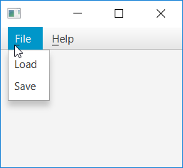
The MenuBar provides applications with a visual drop down menu similar to that most desktop applications have at the top of their application window. The MenuBar is represented by the class javafx.scene.control.MenuBar. Here is an example screenshot of what a MenuBar can look like:
Before you can use the MenuBar you must create a MenuBar instance. Here is an example of creating a MenuBar instance:
MenuBar menuBar = new MenuBar();
Before a MenuBar becomes visible you will have to add it to the scene. Here is an example of adding a MenuBar to the scene graph:
public void start(Stage stage) {
    MenuBar menuBar = new MenuBar();

    VBox vBox = new VBox(menuBar);
    Scene scene = new Scene(vBox, 960, 600);

    stage.setScene(scene);
    stage.show();
}
Notice how the MenuBar is added to the root layout (VBox) of the scene. This places the MenuBar at the top of the application window.
Note that the above example does not add any menus or menu items to the MenuBar, so if you run the example you will not actually see the MenuBar. We will see how to add menus and menu items in the following sections.
Once the MenuBar instance is created, you can add Menu instances to it. A Menu instance represents a single vertical menu with nested menu items. Thus, you can add multiple Menu instances to a MenuBar to add multiple vertical drop down menus.
Menu menu1 = new Menu("Menu 1");
MenuBar menuBar = new MenuBar();
menuBar.getMenus().add(menu1);
Here is a screenshot showing the MenuBar as configured by the example code above:
As you can see, there is only a single menu in the MenuBar titled Menu 1. This menu has no menu items nested under it. Once you have created a Menu instance you must add one or more MenuItem instances to it. Each MenuItem corresponds to a menu item in the menu it is added to. Here is an example of adding 2 MenuItem instances to a Menu, which is then added to a MenuBar:
Menu menu = new Menu("Menu 1");
MenuItem menuItem1 = new MenuItem("Item 1");
MenuItem menuItem2 = new MenuItem("Item 2");

menu.getItems().add(menuItem1);
menu.getItems().add(menuItem2);

MenuBar menuBar = new MenuBar();
menuBar.getMenus().add(menu);
The MenuBar configurations created in the previous examples do not react if you select any of the menu items. In order to respond to the selection of a MenuItem you must set an event listener on the MenuItem. Here is an example of adding an event listener to a MenuItem:
MenuItem menuItem1 = new MenuItem("Item 1");

menuItem1.setOnAction(e -> {
    System.out.println("Menu Item 1 Selected");
});
Sub menus
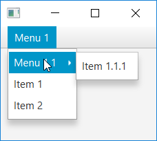
The MenuBar supports multiple layers of menus. A menu nested inside another menu is called a submenu. The Menu class extends the MenuItem class and can therefore be used as a menu item inside another Menu instance. Here is an example that creates a single menu with a submenu inside:
Menu menu = new Menu("Menu 1");

Menu subMenu = new Menu("Menu 1.1");
MenuItem menuItem11 = new MenuItem("Item 1.1.1");
subMenu.getItems().add(menuItem11);
menu.getItems().add(subMenu);

MenuItem menuItem1 = new MenuItem("Item 1");
menu.getItems().add(menuItem1);

MenuItem menuItem2 = new MenuItem("Item 2");
menu.getItems().add(menuItem2);

MenuBar menuBar = new MenuBar();
menuBar.getMenus().add(menu);
The MenuBar resulting from the above example will look similar to this:
TableView
The TableView control enables users to create a Table of multiple rows and column. The TableView control is represented by the class javafx.scene.control.TableView. The vertical items are called columns and are represented by the JavaFX control TableColumn, the horizontal lines are called rows and are represented by the JavaFX control TableRow. The TableView component can be usefull to display multiple object with multiple values, such as an address book.
Defining a TableView
In this chapter we are creating an address book using the TableView
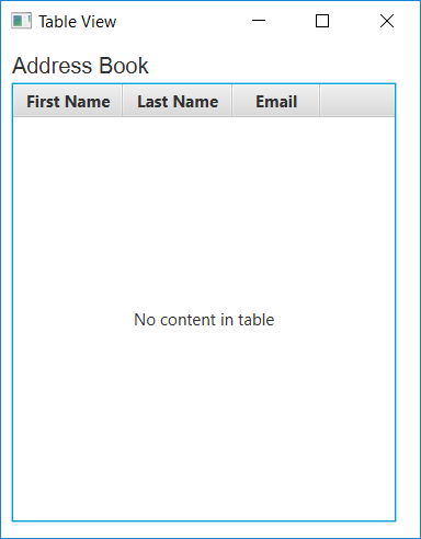
The screen capture is created using the following code:
private TableView table = new TableView();

    @Override
    public void start(Stage stage)  {
        Scene scene = new Scene(new Group());
        stage.setTitle("Table View");
        stage.setWidth(400);
        table.setPrefWidth(350);
        stage.setHeight(500);

        Label label = new Label("Address Book");
        label.setFont(new Font("Arial", 20));

        table.setEditable(true);

        TableColumn firstNameCol = new TableColumn("First Name");
        firstNameCol.setPrefWidth(100);
        TableColumn lastNameCol = new TableColumn("Last Name");
        lastNameCol.setPrefWidth(100);
        TableColumn emailCol = new TableColumn("Email");

        table.getColumns().addAll(firstNameCol, lastNameCol, emailCol);

        VBox vbox = new VBox();
        vbox.setSpacing(5);
        vbox.setPadding(new Insets(10, 0, 0, 10));
        vbox.getChildren().addAll(label, table);

        ((Group) scene.getRoot()).getChildren().addAll(vbox);

        stage.setScene(scene);
        stage.show();
    }
The table control is created by instantiating the class TableView. In the example it is added to the VBox layout container, however, you can add it directly to the application scene.
The example defines three columns to store the following information in an address book: a contact’s first name and last name, and an email address. The columns are created by using the class TableColumn.
The getColumns method of the class TableView adds the previously created columns to the table. In your applications, you can use this method to dynamically add and remove columns.
You can manage visibility of the columns by calling the method setVisible. For example, if the logic of your application requires hiding user email addresses, you can implement this task as follows:
emailCol.setVisible(false)
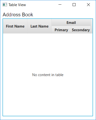
When the structure of your data requires a more complicated representation, you can create nested columns.
For example, suppose that the contacts in the address book have two email accounts. Then you need two columns to show the primary and the secondary email addresses. Create two subcolumns, and call the method getColumns on the object emailCol as shown in the example.
TableColumn firstEmailCol = new TableColumn("Primary");
TableColumn secondEmailCol = new TableColumn("Secondary");

emailCol.getColumns().addAll(firstEmailCol, secondEmailCol);
After you have added these lines to code, and compiled and run the application code, the table appears as shown in the figure down here.
Although the table is added to the application, the standard caption No content in table appears, because no data is defined. Instead of showing this caption, you can use the method setPlaceholder to specify a Node object to appear in an empty table.
Data Model
When you create a table in a JavaFX application, it is a best practice to implement a class that defines the data model and provides methods and fields to further work with the table. The following code creates the Person class to define data in an address book.
public class Person {
    private SimpleStringProperty firstName;
    private SimpleStringProperty lastName;
    private SimpleStringProperty email;

    public Person(String firstName, String lastName, String email) {
        this.firstName = new SimpleStringProperty(firstName);
        this.lastName = new SimpleStringProperty(lastName);
        this.email = new SimpleStringProperty(email);
    }

    public String getFirstName() {
        this.return firstName.get();
    }

    public void setFirstName(String firstName) {
        this.firstName.set(firstName);
    }

    public String getLastName() {
        return this.lastName.get();
    }

    public void setLastName(String lastName) {
        this.lastName.set(lastName);
    }

    public String getEmail() {
        return this.email.get();
    }

    public void setEmail(String email) {
        this.email.set(email);
    }
}
TabPane
Tabs are very useful components to split a single screen into multiple pages. This functionallity is provided using the class Tab which represent a tabpage and the tab control class TabPane
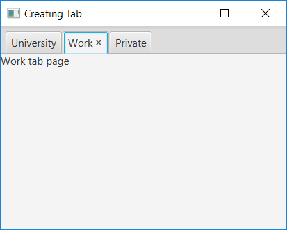
The following code is used to create the example above:
@Override
    public void start(Stage stage)  {
        stage.setTitle("Creating Tab");

        TabPane tabpane = new TabPane();

        // create multiple tabs
        Tab universityTab = new Tab("University");
        Label universityLabel = new Label("University tab page");
        universityTab.setContent(universityLabel);

        Tab workTab = new Tab("Work");
        Label workLabel = new Label("Work tab page");
        workTab.setContent(workLabel);

        Tab privateTab = new Tab("Private");
        Label privateLabel = new Label("Private tab page");
        privateTab.setContent(privateLabel);

        tabpane.getTabs().addAll(universityTab, workTab, privateTab);

        Scene scene = new Scene(tabpane, 600, 500);
        stage.setScene(scene);
        stage.show();
    }
In the example above we first create the Tab control using the class TabPane, after that we create three tabpages using the class Tab and add all the tabs to the tab control, using the code tabpane.getTabs().addAll(universityTab, workTab, privateTab);.
The context of each tab page is set using the method setContent. The content can be a single UI control or a layout manager with multiple controls.
Exercise gui-extra-4 PC Configuration tool
In this exercise you will create a program to build multiple PC configurations.
gui-extra-4.1 Create a binding class to store the configuration
Create a new class
Configurationwith the following attributes
private SimpleStringProperty cpu: Installed CPUprivate SimpleStringProperty gpu: Installed graphics cardprivate SimpleStringProperty memory: Installed memoryprivate SimpleStringProperty owner: contains the owner of the hardwarweCreate getters and setters for all the attributes, note: use type of
String. Also implement a constructor with these parameters.gui-extra.4-2 Building of the GUI
The first step is to create a similar GUI as shown the picture above.
- Add three
ComboBoxes andLabels for CPU, GPU, Memory- Add a
Labeland aTextFieldto fill in the owner of the configuration.- Create a
Buttonwith the text Add configuration- Add a
TableViewthat is attached togui-extra-4.3 Disabling buttons
Make sure the Add Configuration button can only be clicked if something is selected in the comboboxes, and if something is typed into the textfield. It should be disabled if a new configuration can not be added
